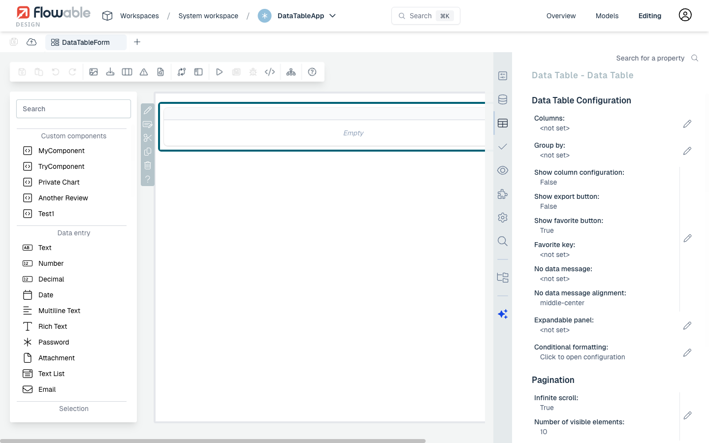
Data Table
The Data Table component allows you to display complex data in a tabular form.
Through the Selection Mode, Data Tables can also serve as input components.
Selected rows are stored in a variable.
Example: Static Data Source
A data table with a static data source is a good way to understand the basic concepts. In the form editor, drag a Data table component onto the canvas. Then configure the columns and static items.
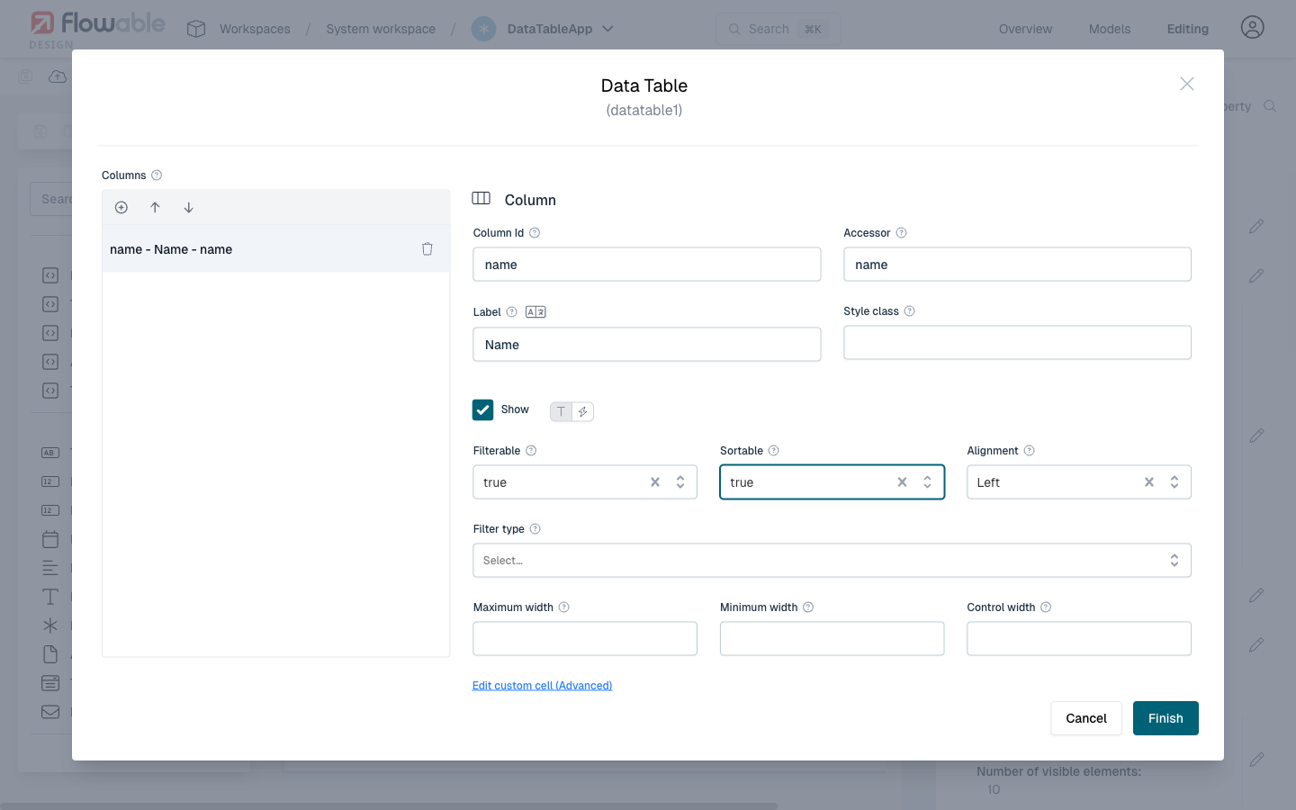
Setting Up Columns
In the right-hand side panel, find the Columns property under the Details section and click the edit icon. Add columns by clicking Add item and configure each column:
For each column, set the following:
- Model Id: identifies the property in each data item
- Accessor: how the data is accessed (for static data, same as the Model Id; for REST data, this can be a nested path like
attributes.name) - Label: the column header displayed to the user
- Filterable and Sortable: enable filtering and sorting on the column
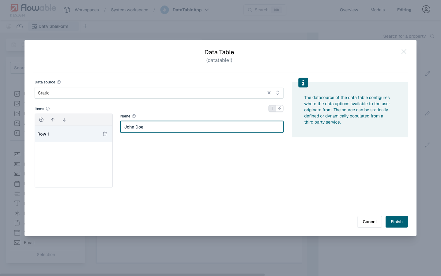
Configuring Static Items
Scroll down to the Data source section and click on Items. Fill in the data rows with the values that match your column accessors:
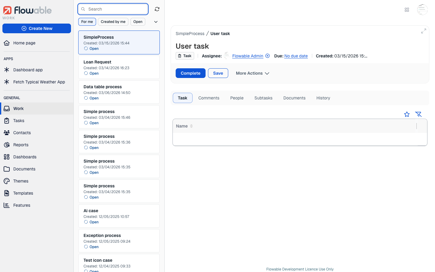
Result
After publishing the app and starting a process instance, the data table is rendered in the task form with the configured columns and static data:
Example: REST Data Source
Introduction
This How-To shows you how to enhance your dashboard with a list of your processes and/or cases using a REST data source. A data table based on a REST endpoint will be created which displays business information, with the ability to navigate to the specific cases or processes.
This guide assumes you already have an app with a page model in Flowable Design.
Adding a Data Table Component
Open your page model in the page editor in Flowable Design. In the left-hand palette, search for Data table.
You will see several data table types listed:
- Data Object Data Table – for data objects
- Service Model Data Table – for service models
- Query Data Table – for query models
- Data Table – the generic, configurable data table (this is the one we need)
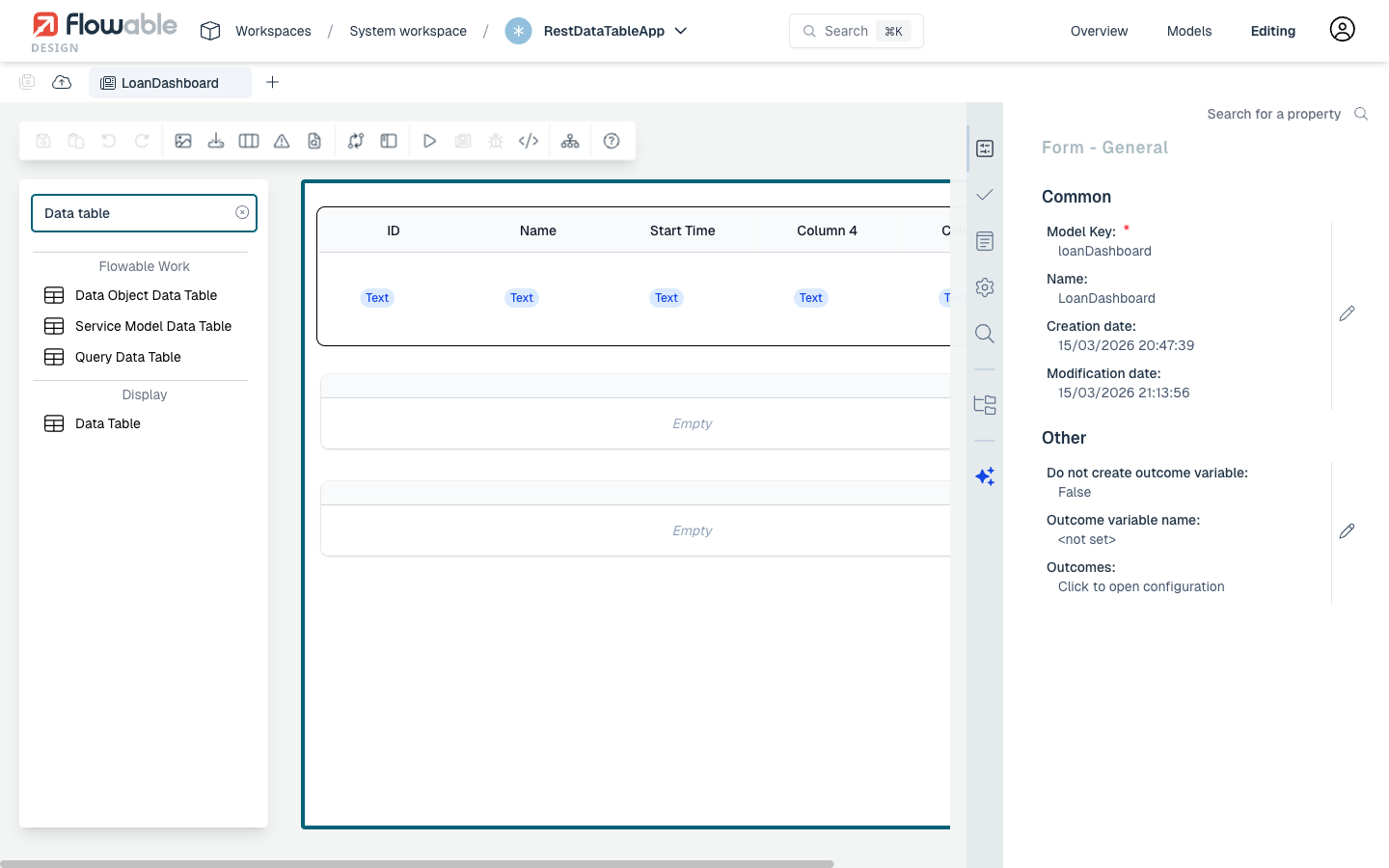
Drag the Data Table component from the palette and drop it onto the page canvas. Once placed, click on the data table to select it. The right-hand panel will show the General properties.
Configuring the REST Datasource
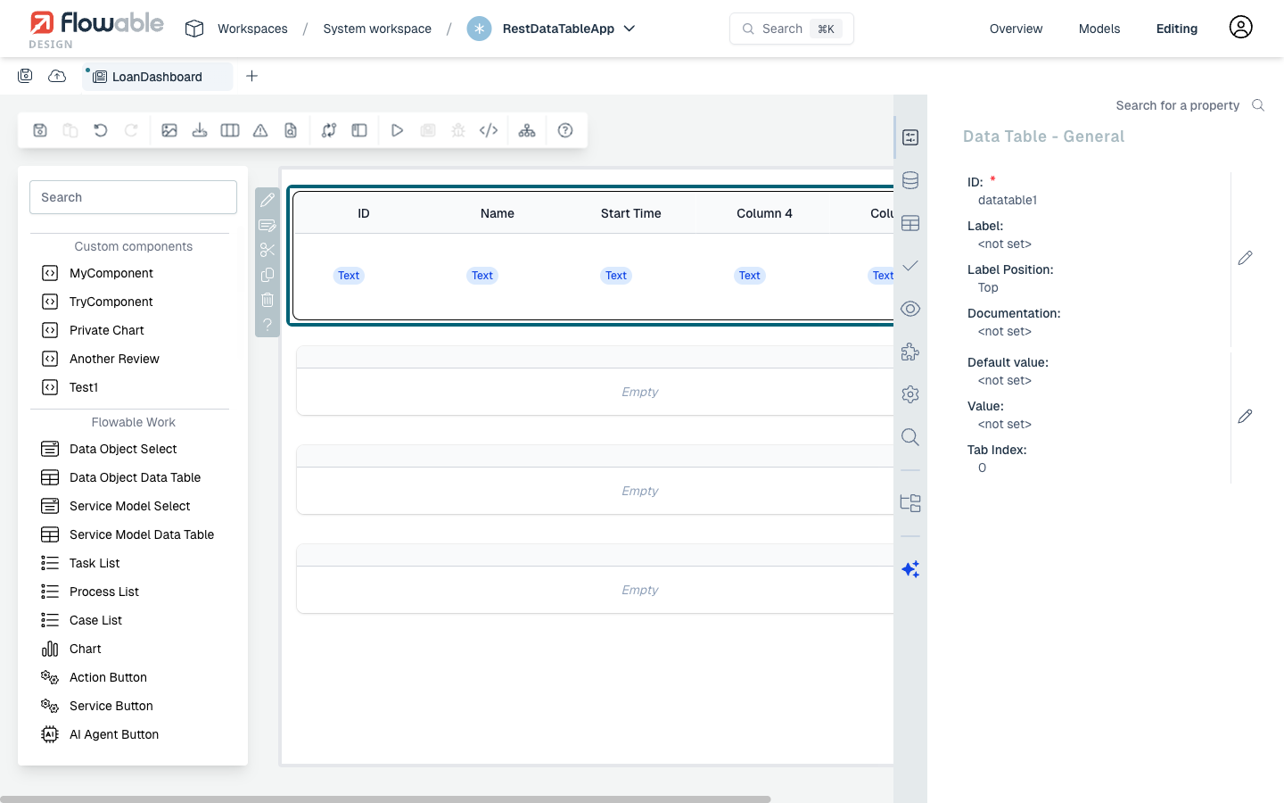
With the data table selected, click on the Datasource tab in the right-hand properties panel (the icon that looks like connected nodes). You will see a Datasource property — click the pencil icon to open the datasource configuration dialog.
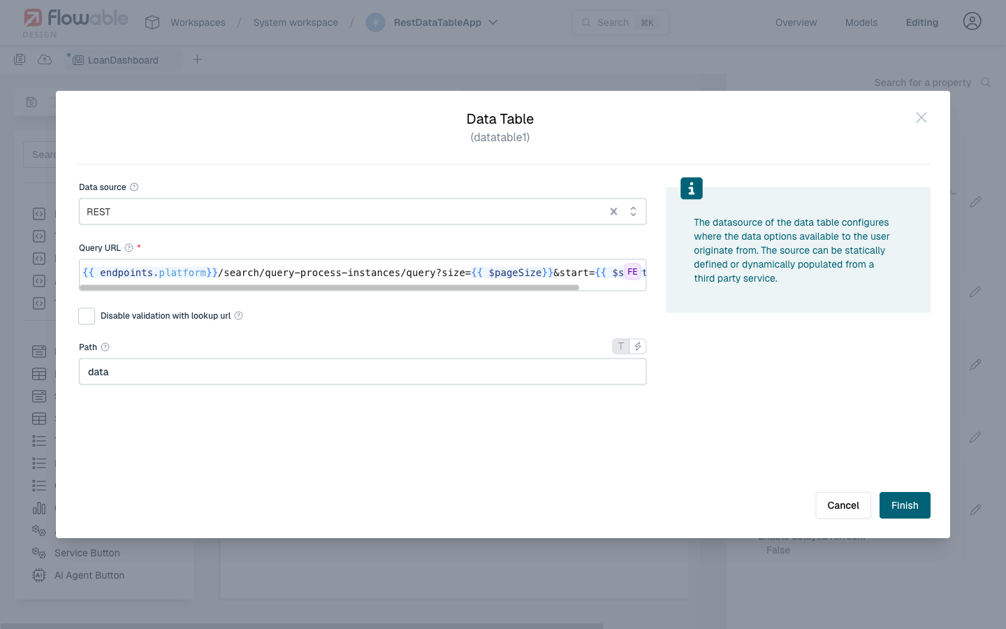
In the Data source dropdown, select REST. This reveals the REST-specific configuration fields:
-
Query URL: The REST endpoint to fetch data from. You can use Flowable expressions like
{{endpoints.platform}}to reference the platform base URL. For example, to query process instances:{{endpoints.platform}}/search/query-process-instances/query?size={{$pageSize}}&start={{$start}}The
{{$pageSize}}and{{$start}}variables are automatically provided by the data table component for pagination. -
Path: The JSON path within the response where the array of data items is located. For the Flowable search API, set this to
data.
 Pagination Variables
The data table automatically provides the following variables that you can use in the Query URL:
{{$pageSize}}– the number of items per page{{$start}}– the starting index for the current page
These allow the REST endpoint to return paginated results. You can configure the page size in the Data Table Configuration section of the properties panel under Number of visible elements.
Click Finish to save the datasource configuration.
Configuring Columns
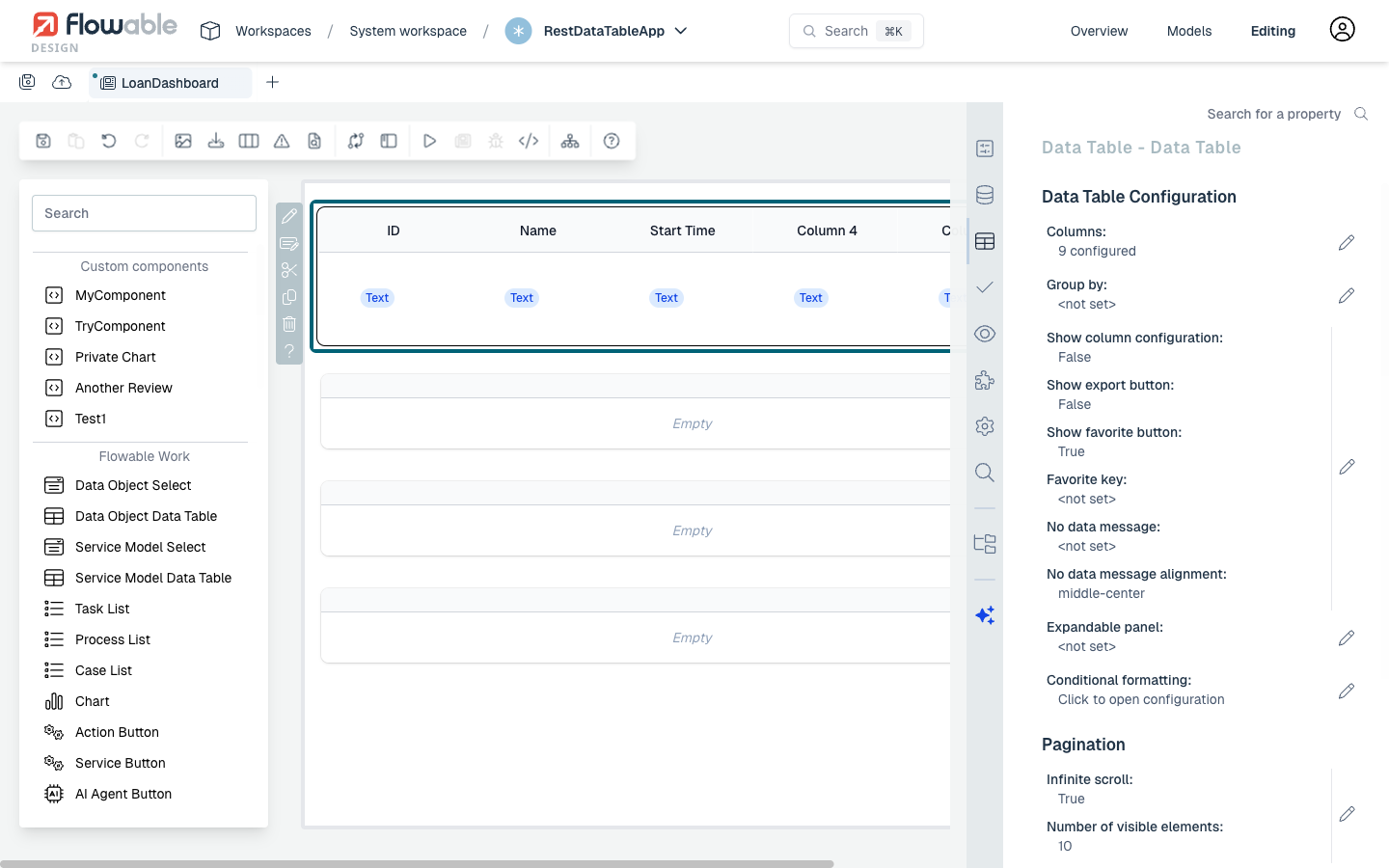
With the data table selected, click on the Data Table tab in the right-hand properties panel. You will see the Data Table Configuration section showing settings like Columns, Group by, pagination options, and more.
Click the pencil icon next to Columns to open the column editor dialog.
Use the ⊕ button to add columns. For each column, you need to configure:
- Column Id: A unique identifier for the column
- Accessor: The JSON property name in the REST response data to display in this column. For nested properties, use dot notation (e.g.,
processDefinitionName). - Label: The display header text shown to the user
You can also configure additional options like Filterable, Sortable, Alignment, and Width settings for each column.
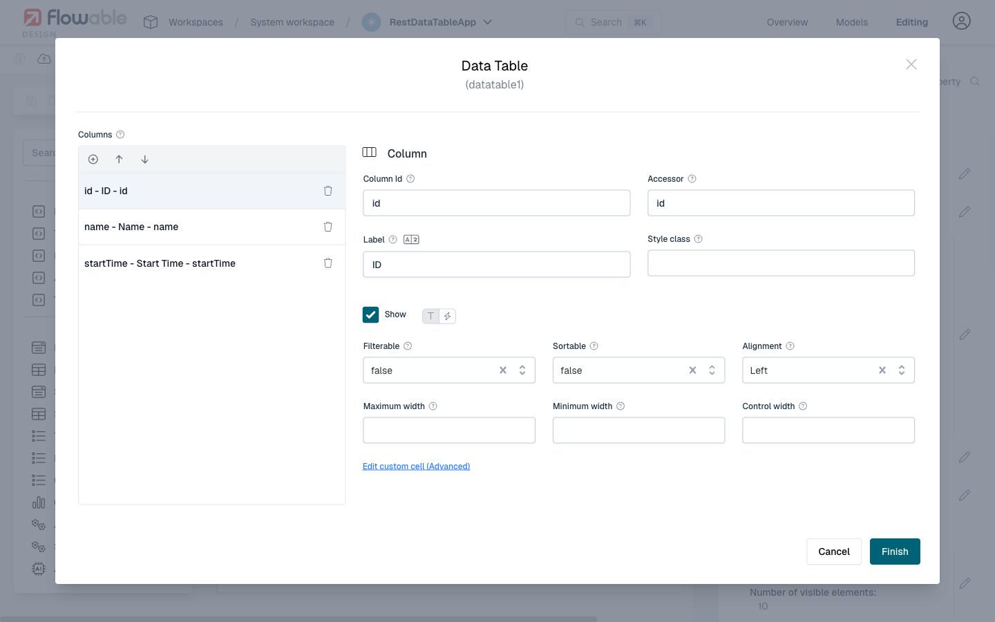
In the example above, three columns are configured:
id– displaying the process instance IDname– displaying the process instance namestartTime– displaying when the process was started
Click Finish when you have configured all needed columns.
Publishing and Viewing the Result
Save your page model by clicking the save icon. Then publish the app by clicking the app name dropdown in the header bar and selecting Publish App model.
Navigate to Flowable Work and open your app's page. The data table will now display live data fetched from the configured REST endpoint, with pagination handled automatically.
 Additional Configuration
- Row URL: You can configure a Row URL in the Data Table properties to enable navigation when a user clicks a row. For example, set it to
{{flowable.contextUrl}}/work/#/work/{{id}}to navigate to the detail view of a process instance. - Conditional Formatting: Use conditional formatting to highlight rows based on specific data values.
- Custom Cell Rendering: For advanced use cases, you can use the "Edit custom cell" option on a column to define custom rendering logic.
Example: Interactive REST Data Table
Properties
noteThis component uses a Data Source.
General
| Attribute | Type | Description | Category |
|---|---|---|---|
| Model Id | String | This is a unique id for the component. | Every field on a form model needs a unique ID, which is automatically generated but can be changed if needed (e.g. to reference in expressions or for debugging purposes). If the field type supports rendering a label, and most types do, it can be configured here. This label is a displayed on the form to the end user and typically indicates what value is expected in the field. The documentation property holds free-form text that can be used to give more details about this data table, like its purpose, usage in other models, etc. |
| Label | Text | The label attribute adds a label to the component. | |
| Label position | Selection:
| The position of the label, you can choose between left or top. | |
| Label tooltip | Text | When it is defined, a question mark icon will appear in the component label. When the user hovers over it it will show this text in a tooltip. | |
| Documentation | Multiline Text | A free-form text to explain the use cases for this form field. | |
| Default value | Text | If the value is not set, the default value will be used. | The purpose of a form is to either display some value or to have users provide values for the various fields of a form. In both situations, this value needs to be bound to an identifier using the {{myValue}} notation, and the value provided by the user will be stored in a variable with that identifier. If there already was a value bound to the identifier before, for example because another form had a field bound to the same identifier, it will be displayed. |
| Value | Text | Expression pointing where in the payload to store the selection. Required to make the component selectable. | |
| Tab Index | Integer | Determine their relative ordering for sequential focus navigation. Tab index will be ignored if the component is inside a subform. |
Datasource
| Attribute | Type | Description | Category |
|---|---|---|---|
| Data source | Selection:
| Options to select different types of Data source. | The datasource of the data table configures where the data options available to the user originate from. The source can be statically defined or dynamically populated from a third party service. |
| Table Key | Text | Key of the Master Data Table | |
| Include Translations | Boolean | Flag indicating whether master data instance translations should be included in the fetched data. | |
| Query URL | Text | URL to request the items with optional variables. $searchText: Text the user typed if the component allows search. $start: First item index (for pagination). $pageSize: Number of items per page. $page: The current page which is displayed. $sort: The entire sort pattern constructed based on the "Sort Pattern" field. Useful when multi-field sort is enabled. $sortColumn: Column used for sorting. $sortDirection: Direction of sorting according to the fields Sort ascending/descending. $sortConfig: A list of sort objects specifying the different sorting behavior (containing objects with id and direction). $filter: A filter string which is generated based on the filter configuration. $filterConfig: Configuration of the acutal filters. This is a list of objects with the keys id and value. eg. {{endpoints.idm}}/users?start={{$start}}&size={{$pageSize}} | |
| Path | Text | When using a REST data source, this is the location in the response data to get the row collection. | |
| Items | DataTableItems | When using a 'static' datasource, the items need to be defined. If no values are shown, make sure you have configured the 'columns' property, as the items are defined by giving values for the different columns. | |
| Data object model | dataobjectselectsearch | Defines which type of data object data is returned when using the select and which operation is used. | |
| Query Parameters | List | The query parameters that should be added to the Query URL. $searchText: Text the user typed if the component allows search. $start: First item index (for pagination). $pageSize: Number of items per page. eg. /rest/users?start={{$start}}&size={{$pageSize}} | Query parameters will be added to the REST requests that are executed when data is fetched to display in the data table. |
| Storage | Selection:
| Specifies how the data retrieved by the REST endpoint should be stored in the variable. Choose 'ID' if only the ID of the selected entry should be saved in the variable, choose 'Full value' if the whole object should be saved and thus making it possible to display other values of the selected element within the form as well. Pay attention as storing the full value could lead int bloating the variables with unnecessary information depending on the amount of data retrieved by the REST endpoint. | Advanced configuration options of the datasource. Please check the tooltips on each property for more information. |
| Map to | Text | The attribute of an item to map to. For a Static data source 'value' is commonly used as the map to attribute and for a REST data source 'id' is commonly used as the map to attribute. | |
| Map to | Selection:
| The attribute of an item to map to. For a Static data source 'value' is commonly used as the map to attribute and for a REST data source 'id' is commonly used as the map to attribute. | |
| Track by | Text | The attribute to uniquely reference an item for tracking may improve form frontend performance. For 'REST' datasource is usually 'id', for Static data is usually 'value'. | |
| Row URL | Text | URL to go when row is clicked. Please use `$item` and `$rowIndex` to access row data, e.g. https://example.org/search?q={{$item.first_name}}&id={{$rowIndex}} | |
| Row URL target | Text | When Row URL is defined, native link target, for example, _self (_blank is default). | |
| Response object | ComplexKeyValue | Response object containing server pagination data. | When using paging, this allows to map the total, next and previous pages. The next and previous should be URLs. |
| Show refresh button | Boolean | Display a button with the ability to reload data in the table. | Will fetch data again after displaying it. Will stop after a few tries when the data doesn't change. |
| Refresh time | Text | If provided, the content will be updated after the given number of milliseconds. | |
| Enable delayed refresh | Boolean | Updates the table with new data in a delayed way and it stops eventually after few seconds. |
Data table
dataTableDetails
| Attribute | Type | Description | Category |
|---|---|---|---|
| Enable/Disable row selection | Text | A boolean expression used to enable/disable row selection. For example, {{$item.id % 2 === 0}} will disable selection for every item with an even id. The boolean expression is evaluated against the current row object. The row object is available as $item. | Fields can also be shown or hidden based on the visible condition. This can be a frontend expression in the form of {{myExpression}} which can reference other form field values by their IDs. Fields can also be enabled or disabled, and similarly this can be made dynamic based on a frontend expression. Some field types can be ignored (the property is shown here if that's the case), which means that its value won't be taken into account. |
| Columns | DataTableColumns | A list of objects containing column definitions. | The columns define how the data of the data table will be displayed to the user. |
| Group by | String | The property key used to group the data (all items in which the chosen property is undefined will be grouped as 'undefined'). | |
| Label for undefined group | Text | The label that will be used for all undefined values for the chosen grouping identifier. | |
| Group value mapping | List | A list of objects containing the group value and the corresponding label. | |
| Show column configuration | Boolean | When true the user will have a tool to show and hide columns and to reorder them. | Advanced configuration properties to change how the data table is displayed to the user. |
| Show export button | Boolean | Display a button with the ability to export the data in the table. | |
| Export delimiter | Text | Indicates the character that delimits the values of the rows when they are exported. | |
| Show favorite button | Boolean | Display the favorite button. | |
| Favorite key | String | The data table favorites identifier. All data tables with this key will share the same favorites. If this is not configured then it is computed based on the form key and the data table id. | |
| No data message | Text | Message shown when there is no data. | |
| No data message alignment | Selection:
| No data message alignment | |
| Expandable panel | Reference | Subform with additional row information. It is collapsed by default and the user can expand it. You can use the keyword $item in expressions inside the subform to access the current row's data | Optional form with additional row information. It is collapsed by default and the user can expand it. You can use the keyword $item in expressions inside this form to access the current row's data |
| Expandable panel visibility condition | Text | Set visibility of the expandable panel based on an expression. | |
| Expandable panel variable name | Text | The name of the variable to store the expandable panel data (without curly brackets). | |
| Conditional formatting | List | Each rule is an Object which should contain a condition and an optional style. Only the first rule with a true condition will be applied. | Advanced formatting rules, based on frontend expressions (the conditions), that can change the how the data in the data table is displayed to the user. |
paginationDetails
| Attribute | Type | Description | Category |
|---|---|---|---|
| Infinite scroll | Boolean | When this is enabled, a vertical scroll is displayed instead of the pagination footer. The next scrolling request it is calculated from the start and size property from the previous request, so these should be present in the service data response. | Configure whether or not the table uses infinite scrolling. If not using infinite scrolling, the paging (showing the classic total number of page and the current page the user is at) can be configured. Note that using client side pagination means that all data will be retrieved from the server-side at once. |
| Number of visible elements | Integer | How many elements should be visible in the data table. This implicitly defines the height of the component, as a scrollbar will be shown when there are more elements. Leave empty to use the default setting. | |
| Show pagination | Boolean | Enable the pagination bar and buttons. | |
| Auto-hide pagination | Boolean | Hides the pagination when there are less rows than the page size. Furthermore, it will hide the pagination in case there are no rows. | |
| Client side pagination | Boolean | Enable browser-side pagination. | |
| Show total records | Boolean | Enable to show the total number of records found. | Using the Page size, the default size of a page requested from the server-side (if not using client-side pagination) is set. The different page size available to the user are configured with the Page size options*. |
| Page size | Integer | The number of rows per page. | |
| Page size options | List | Options for the page size selector. Default is: [5 10, 20, 25, 50, 100]. |
Validation
| Attribute | Type | Description | Category |
|---|---|---|---|
| Required | Boolean | The required flag specifies if entering a value for the component is mandatory. | Providing proper data in form fields is important, especially when in process, case, decision or any other models the values provided in the form fields are used in subsequent steps. To make sure that the data is correct, validation is crucial. For this reason, a form can only be submitted when all fields are valid and thus all validation properties configured on the left apply. Check the tooltips on the properties for more information. |
| Validation Panel Display | Selection:
| Display at validation panel and validation tooltip. | |
| Custom validations | List | List of additional validations to apply. | The data table can have custom validation rules beyond the standard set of validations. Such a rule is written as a frontend expression in the form of {{myExpression}}. If this expression evaluates to false, the submission of the form won't be possible. |
Rendering
| Attribute | Type | Description | Category |
|---|---|---|---|
| Description | Text | The description attribute adds a description to the component. | Some field types have an extra line of text displayed to give the user more details about the field. |
| Selectable | Selection:
| Will make rows selectable using Single (radio buttons) or Multiple (checkboxes). | Fields can also be shown or hidden based on the visible condition. This can be a frontend expression in the form of {{myExpression}} which can reference other form field values by their IDs. Fields can also be enabled or disabled, and similarly this can be made dynamic based on a frontend expression. Some field types can be ignored (the property is shown here if that's the case), which means that its value won't be taken into account. |
| Ignored | Boolean | If true the component will be hidden and the value will not be part of any payload. | |
| Total Rows | Text | Output only binding for the total number of rows. Use an expression, for example '{{$temp.numRows}}'. | |
| Visible | Boolean | Boolean value or expression specifies whether the component is visible or hidden. This expression might include another value in the same form, for instance use a checkbox bound to {{showAdditionalFields}} and use the very same expression as the visible attribute to show or hide the component according the checked state of the checkbox. If you want to only show the component, if the form is not used as the init-form, you can use the expression '{{root.id}}' which evaluates to true only, if there is a current case id which is not the case in an initialization form. | |
| Enabled | Boolean | Boolean value or expression specifies whether component is enabled or disabled. | |
| Style class | Text | Stylesheet class name. Add any style classes to be applied to the component for the desired styling and rendering. | The data table can get customized CSS classes to customize the default styling. Note that the CSS files needed for the customizations must be available on the runtime system. |
Invocation
filtering
| Attribute | Type | Description | Category |
|---|---|---|---|
| Filterable | Boolean | Defines if the column is filterable; overrides the table filterable property. | Enables a filter in the column where the user can type a text. This text is then applied to the URL when querying data. For example with a query url ./flowable?sort=id&{{$filter}} to produce: ./flowable?sort=id&filter[column1]=abc&filter[column2]=test, the filter pattern needs to be set to filter[{{$filterItem.id}}]={{$filterItem.value}} and the filter seperator to &. |
| Filter pattern | Text | For every filter table column where the user typed a value, this pattern will be computed. You can use {{$filterItem.id}} (the column ID) and {{$filterItem.value}} (the text the user wrote in the filter box). | |
| Filter separator | Text | The filter pattern is repeated for every column (with a filter value) and separated by the filter separator, the result is a string that can be used in the query URL with the expression {{$filter}}. | |
| Show filters | Boolean | Show filters as default |
sorting
| Attribute | Type | Description | Category |
|---|---|---|---|
| Sortable | Boolean | Defines if the columns are sortable, identified by arrows next to the column title. | Enable and configure sorting of the data displayed in the data table. Check the tooltips for more information on each property. |
| Multi-sort | Boolean | Defines if sorting supports multi-sort by pressing the shift key. | |
| Sort ascending | Text | When a column is sorted in ascending mode, this string will be sent to the server. | |
| Sort descending | Text | When a column is sorted in descending mode, this string will be sent to the server. | |
| Sort pattern | Text | For every column used in a multisort, this pattern will be computed. You can use {{$sortItem.id}} (the column ID) and {{$sortItem.direction}} (asc or desc, or whatever is defined in the sort ascending and sort descending attributes). | |
| Sort separator | Text | In a multi-sort, one or more characters can be used to separate the items. The sort pattern is repeated for every selected column and separated by the sort separator, the result is a string that can be used in the query URL with the expression {{$sort}}. |
Advanced
| Attribute | Type | Description | Category |
|---|---|---|---|
| Events | List | The data table emits low-level events on which can be reacted with a frontend expression to implement various use cases that are not possible with regular modeling. If the expression produces a value, it can be stored in a new variable using the Result variable property. |
List Attribute Details
Items
| Attribute | Type | Description |
|---|---|---|
| Text | Text | Label for the item |
| Value | Text | Value for the item |
Query Parameters
| Attribute | Type | Description |
|---|---|---|
| Name | Text | The name of the query parameter |
| Value | Text | The value of the query parameter. The value will be automatically URL-encoded. |
| Default Value | Text | The default value for the query parameter (in case the value didn't return anything). The value will be automatically URL-encoded. |
Response object
| Attribute | Type | Description |
|---|---|---|
| Key | Text | A unique identifier |
| Value | Text | The binding for the form field. Use an appropriate expression to bind the component to its value and specify where the value is written/read. For example, use '{{myVariableName}}' to store the value of the field in a variable named 'myVariableName'. Use prefixes to define the scope of the value, for example, 'root.' for referencing the root case/process to store the value in. Please refer to the section 'Frontend expressions' in the Flowable guide for more information. |
Columns
| Attribute | Type | Description |
|---|---|---|
| Column Id | Text | Provide a unique id for the column. For some data sources this is used if the accessor is not a string or to overwrite the column id used in server-side calls. |
| Accessor | Text | Path of the row value to show. This is used to read the actual information. |
| Label | Text | Title in the header of the column |
| Filterable | Selection:
| Defines if the column is filterable; overrides the table filterable property. |
| Filter type | Selection:
| Control column's filter type. For Text and Select filters you can use {{$filterItem.id}} (the column ID) and {{$filterItem.value}} to access the filter data. For Date (Range) filters, you can use {{$filterItem.value.from}} and {{$filterItem.value.to}} to access the filter range. |
| Sortable | Selection:
| Defines if the columns are sortable, identified by arrows next to the column title. |
| Maximum width | Integer | The maximum width of the column, in pixels. |
| Minimum width | Integer | The minimum width of the column, in pixels. If there is extra room, the column will fill available space (up to the max-width, if set). |
| Control width | Integer | A fixed width for the column. This overrides both min and max width options |
| Alignment | Selection:
| How text in this column is aligned. |
| Style class | Text | A custom CSS class (optional). |
| Show | Boolean | |
| Data component | DataComponentType | Can contain the JSON definition of other components. Use this sparingly, as there is no check nor validation being done on component JSON pasted here. |
| Display | Selection:
| |
| displaySettings | BasicFormList |
displaySettings
| Attribute | Type | Description |
|---|---|---|
| Format | Text | The optional ISO8601 format for the date e.g.: 'DD.MM.YYYY' -> '10.01.2014' 'MMMM DD, YYYY' -> 'January 10, 2014' 'dddd DD MMM, YYYY' -> 'Friday 10 Jan, 2014'. |
| Format | Text | |
| Fraction size | Integer | |
| Escape Html | Boolean | When enabled, the Html content of the column will be escaped and shown as text. |
Group value mapping
| Attribute | Type | Description |
|---|---|---|
| Value | Text | The value of the group property. |
| Label | Text | The corresponding label for the group property value. |
Conditional formatting
| Attribute | Type | Description |
|---|---|---|
| Condition | Text | When this expression evaluates to true, the style of this rule will be applied. Please use $item to get the row data {{$item.id > 7}}. In addition, the row index can be accessed through $rowIndex, e.g. {{$rowIndex > 1 && $rowIndex < 4}} |
| CSS class | Text | A custom CSS class that can be used to customize the visualisation. |
| Color | Text | Font color to apply. CSS style format, e.g. lightblue, #f00 |
| Background color | Text | The background color applied (use hex values). |
Page size options
| Attribute | Type | Description |
|---|---|---|
| Page size | Integer | The number of rows per page. |
Custom validations
| Attribute | Type | Description |
|---|---|---|
| Expression | Text | Validation passes when this expression is true. |
| Error message | Text | Message to display when the validation fails. |
Events
| Attribute | Type | Description |
|---|---|---|
| Event label | Text | This is a unique id for the component. |
| Event type | Selection:
| The type of event emitted by the form field. |
| Expression | Text | Validation passes when this expression is true. |
| Result variable | Text | Capture the result of the expression in a result variable. |
Configuration Examples
Conditional Formatting Configuration
| Condition | CSS class | Color | Background color |
|---|---|---|---|
{{$item.id % 2 === 1}} | myOddClass | ||
{{$item.lastName === 'Jackson'}} | red | #1c98a7 |
Response Object Configuration
Assuming the following REST Endpoint:
{
  "meta":{"count":87},
  "next_page":"https://swapi.dev/api/people/?typedText=&page=2",
  "previous_page":null,
  "results": [
    ...
  ]
}
Configuration:
| Key | Value |
|---|---|
| next | next_page |
| previous | previous_page |
| total | meta.count |
Sorting Configuration
To produce: ./api?query=type:USR+sort:asc:type,desc:name
| Field | Value |
|---|---|
| Query URL | ./api?query=type:USR+sort:{{$sort}} |
| Sortable | true |
| Sort ascending | <not set> |
| Sort descending | <not set> |
| Sort pattern | {{$sortItem.direction}}:{{$sortItem.id}} |
| Sort separator | , |
To produce: ./users?sortBy=name&sortDirection=ASC
| Field | Value |
|---|---|
| Query URL | ./users?sortBy={{$sortColumn}}&sortDirection={{$sortDirection}} |
| Sortable | true |
| Sort ascending | ASC |
| Sort descending | DESC |
| Sort pattern | <not set> |
| Sort separator | <not set> |
To produce: ./anime?sort=subtype,-averageRating
| Field | Value |
|---|---|
| Query URL | ./anime?sort={{$sort || 'id'}} |
| Sortable | true |
| Sort ascending | <empty> |
| Sort descending | - |
| Sort pattern | {{$sortItem.direction}}{{$sortItem.id}} |
| Sort separator | , |
Filter Type Configuration
| Field | Value |
|---|---|
| Text | {{$filterItem.id}} {{$filterItem.value}} |
| Select | {{$filterItem.id}} {{$filterItem.value}} |
| Date (Range) v3.17.10+ | {{$filterItem.id}} {{$filterItem.value.from}} {{$filterItem.value.to}} |
Filter Configuration
To produce: ./anime?sort=id&filter[subtype]=TV&filter[text]=magical
| Field | Value |
|---|---|
| Query URL | ./anime?sort=id&{{$filter}} |
| Filterable | true |
| Filter pattern | filter[{{$filterItem.id}}]={{$filterItem.value}} |
| Filter separator | & |
Events
| Event | When | Additional | Cancellable |
|---|---|---|---|
Datatable.dataLoaded | Datatable content is loaded | Definition + State | No |
Datatable.next | Datatable Next button is clicked | Definition + State | No |
Datatable.previous | Datatable Previous button is clicked | Definition + State | No |
Datatable.sort | Datatable column sorting is changed | Definition + State (including sort data) | No |
Datatable.filter | Datatable column filtering is used | Definition + State (including filters data) | No |
See section Events for more information.
Legacy data table
An improved Data Table was introduced in 2025.1.x. When embedding Flowable Forms through the npm packages, you can opt back into the previous implementation by passing the legacyDataTable feature flag to the <Form> component:
<Form additionalData={{ features: { legacyDataTable: true } }} />
When using the full Flowable Work application instead of embedding the form directly, set the same flag through the flowable.frontend.features.legacyDataTable property (see Frontend Features properties).
This transition flag is available in 2025.1.01+ and was removed in 2025.2.x.